Recently, I had a colleague observe that not everyone has an understanding of what “modern website design.” I want to dig deeper into this observation because I think its an important point that may be overlooked. Although most wineries have a website (shout out to the 29% of small businesses that still don’t), there are still a number out there that are in dire need of an visual upgrade. So let’s look at why this is important for your winery business and how to apply it.
What is a “modern” website design?
I believe this is important to understand, so let’s first look at what it means for a website to be “modern” or have a modern design. Another way of putting it might be up to date, current, or contemporary. In this sense, modern does not refer to a certain style or aesthetic (i.e. the bold colors and angular styles of mid-century modern), but rather to the fact that something was designed recently. It gives the impression of relevance, current-ness. A current design can even appear cutting-edge when compared to things that are 5 or 10 years behind.
Design in general almost always follow a trend- loosely speaking, you can identify when a something was made based on its design. This is true even when something is designed to look “vintage”- which almost always means a contemporary take on an old design rather than a completely historically faithful reconstruction. Indeed, designers love picking the best aesthetics from the past and giving them the benefits of all the advances in technology and maturation of styles from that time.
What does it say about a website if the design is not modern?
In a general sense, a design that doesn’t look “modern” may communicate several things, some good and some not so good:
Potential Negatives:
- The brand or company has stopped operating and the website is just a relic.
- The brand or company does still operate, but either doesn’t care about their appearance, or just can’t afford to keep it up to date.
- The brand is old-fashioned. Its not fun, exciting, or new.
Potential Positives
- The brand is timeless.
- The brand is consistent.
- The brand is intentionally subversive*
But let’s narrow this down to the world of web design. Can a website design that was done 5, 10 or 15 years ago still look good, relevant and appealing?
In my opinion, web design is an area where an old design is never a good thing, and here’s why.
Website aesthetics have evolved in a huge number of ways since the early days of the web in the 1990s. For many years, the main factor in creating a web design was the limitations of the technology. Examples include limited available fonts and colors, constrained layouts, and grainy, low-res images. Not having much else to compare it to, users were generally fairly forgiving. But can you imagine if Apple’s original homepage was anywhere on the web today?
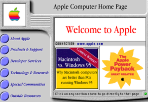
I don’t even know what to say about this image of Apple's homepage from 1996.
As technology advances, designers were able to push the envelope and come up with increasingly better designs (thank goodness!). Being cutting-edge became an extremely important quality- as it would immediately set your website experience apart from the millions of other sites out there. When a winery website combines a killer design with an excellent user experience, this is the gold standard for making your customers (and Google) happy and want to return again and again.
Who should have a modern design ?
There may be instances where having an intentionally out-of-date looking website is actually an asset. After all, at this point they now stand out from the crowd, and it communicates something about their unconventional ways and personality (Ling’s Cars is an example, don’t say I didn’t warn you).
However, it’s a little disingenuous as many sites that are doing this well, have been designed recently or at least received updates, and are not actually just a relic from the past. In other words: this is not a free pass for never updating your site ever again.
Regardless, if you’re a new brand, or a company that evolves over time, and want to appeal to a design-savvy generation, you’re going to want a modern looking design.
What if my target audience is older generations?
First of all, kudos for knowing your target audience and recognizing the importance of designing with them in mind.
When designing for an older audience, most of the focus should be on creating a great user experience (easy to find information, phone numbers listed, etc). Its also worth noting that making your site accessible will be more important because older users may have low vision and need to rely on increased color contrast and larger font sizes. This is where having a modern site is a huge advantage, because of all the advances in assistive technologies.
For some general thoughts about what appeals to different generations, here’s an article from Practical E-Commerce. However, I would be hesitant to assume that an outdated website will continue to appeal to an older generation simply because they are older. While its true that intuitive user experience is more of a priority to those folks, good design attracts and even gives the impression of a better user experience. Regardless, no one is going to be drawn to the original Apple homepage pictured above just because it is easy to use.
How can this be applied to winery websites?
A website is a valuable component of a winery’s overall customer experience and one of the only ways a customer can interact with the brand without being physically present. Imagine the following scenario:
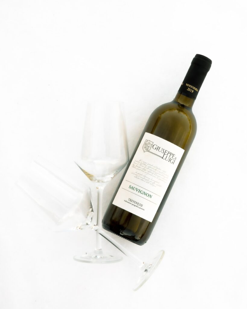
A tourist visits 5 wineries in a day on a Napa Valley winery tour. They particularly enjoyed one wine that they tasted, but didn’t purchase it at the time and failed to note at which winery it was at. Now they are back home and want to shop for some wine. The first thing they do is reference the tour company’s itinerary. From there, they will visit each website to see if rings a bell. Who are they more likely to remember- the winery with a consistent, cohesive and pleasing brand experience across all touchpoints (label, wine bottle, wine glass, tasting notes brochure, and website) or one that doesn’t. Even as the quality of the wine is what attracts them, they need to recall that wine later- and the website is what will jog their memory (in conjunction with solid branding- see my post here about the importance of that- and keeping in mind that a brand logo is more memorable than a brand name).
Many wineries understand the importance of creating a quality product and even the importance of packaging their product in a way that leads to expectations of the wine’s value, luxury status, and quality. The website is part and parcel of the overall impression made on the consumer- you wouldn’t expect a high-end wine from a cheap looking, hard to use, amateur looking website.
It’s important to note that there’s a lot of different components that make up a well-made modern winery website- include responsive and website design, SEO optimized content, intuitive navigation and usability, conversion optimization, adherence to accessibility standards, and visual appeal. By paying attention to all these details, a winery can ensure that its digital presence is the best showcase of its brand and ready to start selling some great wines.