One of the biggest challenges for a new winery brand is figuring out how to stand apart from the competition. With hundreds of wineries competing in the northern California area alone, how are you supposed to stand out?
One seemingly small branding element can make or break your wine’s ability to get the attention it deserves.
Can you guess what that is?
Your logo.
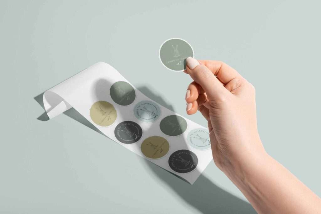
Why Your Winery’s Logo is So Important
A logo communicates the essence of your wine’s brand, values, and story in an instant to your customers. It’s the most distinguishable part of your brand and has the power to evoke strong emotions that lead to brand affinity.
If it’s a good logo.
What Makes a Good Logo?
A good logo is sticky. It should be unique, memorable, timeless, and versatile, allowing your wine brand to evolve while still being recognized as the trusted source your customers have come to love.
Here are five specific tips and ideas to help you brand your wine with a unique logo that’s awesome and unforgettable.
Awesome Wine Logo Tip #1: Avoid Cliches
When something is overused in an industry, it becomes a cliche. This is tricky. Usually, when something is overused, it gets that way because it’s effective or otherwise useful. The problem is that when you hit the tipping point, and it becomes a cliche, it’s no longer effective, and instead of helping people remember your uniqueness, you blend into the competition.
Allowing any type of cliche into your logo design will make it harder for you to stand out.
Here are some examples of common cliches I see used in winery branding:
Burgundy and Gold Colors
Burgundy has an obvious association with red wines, but at this point, it’s so obvious it has become a cliche.
And what’s wrong with Gold?
Nothing, if you want to denote “luxury,” but even that has become overused. Promoting a wine brand as luxury has become so popular it’s the standard. If luxury is the standard, by definition, it’s not luxury.
Classic Serif Fonts
Bonus if they have an inset or embossed effect added. Classic Serif Fonts had a heyday when many of the big-name Napa wineries were getting started. They are everywhere in wine branding, so you should avoid them if you want to be memorable.
Calligraphic Fonts
This is the second most common font I see in winery branding. While the rest of the brand world is obsessed with the hand-drawn script (quickly becoming another cliche in branding), wineries typically have opted for a more traditional calligraphic-style font, usually with a generous amount of flourishes.
Don’t get me wrong- a well-placed flourish can certainly enhance and add interest to a wordmark.
I like the current trend to use them in non-traditional fonts such as very minimal serifs or even sans-serifs. However, in its more traditional forms, these add fussiness and stuffiness to a design under the auspices of looking “elegant.” Think your grandma’s wedding invitations.
Anything That Looks Like a Grape
I talk with my clients about not using “obvious” symbols or illustrations. If you’re an airline, would you use an airplane as your logo? Please say no…
For wineries and other wine-related brands, the almighty grape is perhaps the greatest obvious offender. This goes for grape clusters, vines, leaves, or any other grape-related imagery.
This is especially overdone when it’s done in a traditional style, like a woodcut or a hand drawing.
One caveat here: there are as many ways to illustrate an object as there are wineries in Napa, so if you’re using a new or innovative style that fits your overall brand strategy—then go for it. I’ve seen some interesting geometric grape-esque illustrations that look fantastic and don’t ring any cliche alarm bells.
Wine Ring/Splash
By ring, I mean the ring created by a glass sitting on a surface if some wine has dribbled down the side. (Side note: how did this trend based on bad table habits begin??)
This trend, like every other that has overdone itself to become a cliche was once innovative and exciting. Unfortunately, if you’ve seen one wine stain, you’ve seen them all.
Copycats rarely garner as much attention as the original.
Awesome Wine Logo Tip #2: Differentiate Like You Mean It
There are over 500 wineries in Napa Valley and another 400 in neighboring Sonoma County.
If you’re winery number 901, what makes you different from all the rest?
Who will be drawn to you and resonate with your story?
What about your wine, experience, and service set you apart?
If you prioritize differentiation when you position your wine’s brand strategy and story, you’ll be in a strong position to lean on your brand messaging when you need to create visual brand assets, such as an amazing logo.
The best logos tell a story and give your customers an instant shot of emotion when they think about the story behind the logo. A great designer will be able to wrap your brand’s story and purpose into an elegantly designed logo that speaks volumes in its simplicity.
If you haven’t determined your brand’s story and strategy, I highly recommend going through the process with an experienced brand strategist who can guide you. We’re often too close to our brand to convey the meaning behind our story. A good brand strategist can help you zoom out and see the whole picture.
Awesome Wine Logo Tip #3: Make a Symbol With a Double Meaning
I’m a huge fan of this idea in any industry. Choose something from your business name and something from what you do and tie them together.
One reason this works so well in a logo is that it delights the consumer when they figure out there’s a hidden meaning. They get a dopamine dump from solving the problem, and your logo gets cemented in their memory.
As long as the double meaning isn’t obscure, you’ll delight your customers and stand out as the brand that went the extra mile to avoid being boring and obvious.
Awesome Wine Logo Tip # 4: Put a Unique Spin on Your Initials
The keyword in this tip is unique. Remember, we’re trying to avoid cliches, and combining initials is a common design tactic. You can easily stray into cliche territory if you’re not intentional enough.
The possible combinations for linking together 2 or 3 letters are nearly endless.
Even if you have the same initials as another winery, you can stand out by doing them in a different style.
This works especially well if you have a multi-word business name.
Awesome Wine Logo Tip #5: Get Personal With Symbolism
Rather than choosing the obvious (see above), go for something subtle that gets your vibe across.
Think about what you value and what’s important to you, and choose a symbol that can speak to those things. I had a marketing client who exemplified a classic coastal vibe, so we included a blue heron in her logo.
Another way to do this is to use actual objects owned by the proprietor (ex., a drawing of your favorite flower plus one of the main tools of your trade.)
If you’re unsure what you might want to use to symbolize your essence, working with an experienced designer can help. In my design process, I walk clients through a process of self-discovery that often reveals imagery we can use in this way.
Here’s the bottom line:
If you want a wine brand identity that makes a splash, throw out everything that immediately comes to mind when you think of traditional wines and labels. Don’t look to others to decide what your brand should look like.
Be bold. Be different. Let your story and personality shine through in your brand identity. Allow your identity to reflect the story and purpose behind the brand, and you’ll easily build a wine brand that’s unforgettable.